Saigon Ink Art Center: A Professional Guide to One of Vietnam’s Most Recognized Tattoo Studios
02/08/2026
Traditional Tattoo: History, Symbolism, and Timeless Design Inspiration
02/08/2026Lettering Tattoo: A Complete Guide to Fonts, Styles, and Timeless Typography
Few tattoo styles are as personal as a lettering tattoo. A single word, a meaningful quote, a handwritten signature, or a significant date can carry an emotional weight that rivals even the most elaborate illustrations. Yet despite their minimalist appearance, lettering tattoos are among the most technically demanding designs an artist can create. Every curve, spacing adjustment, and line weight must be executed with precision because even the smallest imperfection becomes immediately noticeable.
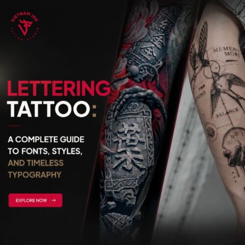
Lettering Tattoo Ideas: Fonts, Styles & Placement Guide
If you’re considering a lettering tattoo, you’re likely exploring font styles, placement ideas, customization options, and long-term readability before booking your appointment. This guide explains how professional tattoo artists design typography that ages gracefully, how to choose the right font and placement, and why thoughtful planning is essential when creating a tattoo you’ll wear for a lifetime.
Why a Lettering Tattoo Requires More Skill Than Many People Realize
Many clients assume text tattoos are simple because they contain no portraits or complex shading. In reality, lettering demands exceptional technical precision.
Unlike larger illustrative tattoos, typography leaves little room for error. A slightly uneven baseline, inconsistent spacing, or irregular stroke width can disrupt the entire composition.
Professional artists carefully evaluate:
- Letter spacing (kerning)
- Line spacing (leading)
- Font balance
- Stroke consistency
- Character proportions
- Reading flow
- Long-term legibility
At VietnamInk, typography projects begin with careful digital layout and multiple placement tests before a stencil is ever applied. This planning helps ensure the finished tattoo complements both the message and the body.
Designing a Lettering Tattoo That Ages Beautifully
The goal isn’t simply creating beautiful lettering today—it’s creating typography that remains readable years from now.
As skin naturally changes over time, extremely thin lines and tightly packed letters may gradually soften. Experienced tattoo artists compensate by adjusting letter spacing, stroke thickness, and overall scale to preserve clarity.
A slightly larger design often ages more gracefully than one reduced to the smallest possible size.
Choosing the Right Font
Typography shapes the emotional tone of a tattoo just as much as the words themselves.
Some of the most popular font categories include:
Script Fonts
Elegant and flowing, script lettering is often chosen for:
- Personal names
- Romantic quotes
- Memorial tattoos
- Inspirational phrases
Script requires careful attention to spacing because connected letters can become difficult to read if made too small.
Serif Fonts
Classic serif typography communicates tradition and sophistication.
Ideal for:
- Latin phrases
- Literary quotations
- Historical references
- Family mottos
The small finishing strokes provide structure while maintaining excellent readability.
Sans Serif Fonts
Minimalist sans serif fonts emphasize clean geometry.
These styles suit:
- Modern aesthetics
- Single words
- Coordinates
- Dates
- Minimal tattoos
Because of their simplicity, precise line work becomes especially important.
Gothic and Blackletter
Inspired by medieval manuscripts, these dramatic fonts feature bold contrast and decorative flourishes.
They work best for:
- Large-scale typography
- Chest pieces
- Forearms
- Back tattoos
Very small Blackletter tattoos can lose definition over time due to intricate internal details.
Handwriting Tattoos
Some of the most meaningful lettering tattoos preserve authentic handwriting from:
- Parents
- Grandparents
- Partners
- Children
- Personal journals
Rather than recreating the text with a digital font, experienced artists carefully trace the original writing while refining minor inconsistencies that could affect tattoo longevity.
Choosing the Right Words
Beautiful typography cannot compensate for words chosen impulsively.
Before committing, consider:
- Does the message still resonate years from now?
- Is the spelling correct?
- Has the translation been professionally verified?
- Will the phrase remain meaningful throughout different stages of life?
For tattoos in foreign languages, always verify grammar and cultural context before tattooing.
Experienced artists encourage clients to research thoroughly because correcting text tattoos is considerably more difficult than correcting illustrations.
Best Placement Ideas
Placement influences readability, healing, and overall composition.
Popular locations include:
Forearm
One of the most versatile placements.
Ideal for:
- Quotes
- Single words
- Names
- Dates
The relatively flat anatomy supports clean typography and easy reading.
Collarbone
Elegant and discreet.
Often chosen for:
- Inspirational phrases
- Short quotes
- Delicate script
Curved anatomy requires careful stencil adjustment to maintain even spacing.
Rib Cage
A favorite location for deeply personal messages.
Benefits include:
- Privacy
- Long flowing compositions
- Large vertical space
Because ribs expand during breathing, artists account for natural body movement while placing the stencil.
Spine
The spine creates a striking vertical composition suitable for:
- Single words
- Poems
- Religious verses
- Minimal typography
Precise alignment is essential because even slight deviations become noticeable.
Wrist
Perfect for short messages and meaningful reminders.
However, artists generally recommend avoiding excessively small lettering, as wrist tattoos receive frequent movement and sun exposure.
Matching Font Size to Longevity
One of the most common mistakes clients make is requesting text that’s too small.
Professional artists understand that tattoo ink naturally softens within the skin over time.
For optimal longevity:
- Leave sufficient space between letters.
- Avoid overly decorative micro-fonts.
- Increase size when using detailed script.
- Prioritize readability over miniature aesthetics.
Choosing slightly larger typography often produces a cleaner tattoo ten years later.
Tattoo Procedure for Lettering
Despite their minimalist appearance, lettering tattoos demand careful execution.
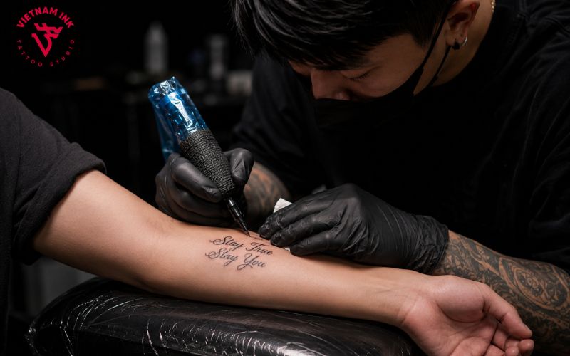
Tattoo Procedure for Lettering
Professional artists typically begin by:
- Printing multiple font variations.
- Adjusting spacing digitally.
- Creating a stencil.
- Testing placement on the body.
- Refining alignment before tattooing.
Needle selection varies according to the design.
Fine script often uses small round liner configurations, while bold typography may require larger liners or magnum needles for consistent fill and smooth edges.
Steady hand speed and precise skin stretching are essential for maintaining crisp letterforms.
Healing and Long-Term Care
The healing process significantly influences the appearance of lettering tattoos.
Caring for Your Lettering Tattoo During Healing
Typography relies on crisp edges and consistent contrast, making proper aftercare particularly important.
Professional recommendations include:
- Wash gently with fragrance-free soap.
- Apply a thin layer of tattoo moisturizer.
- Avoid soaking the tattoo.
- Wear loose clothing over the area.
- Protect the tattoo from direct sunlight.
- Never scratch peeling skin.
Initial healing usually takes two to four weeks, while deeper dermal recovery continues for several months.
Even after healing, daily sunscreen remains one of the most effective ways to preserve sharp lettering and prevent premature fading.
Custom Lettering vs. Downloaded Fonts
Rather than choosing a font directly from the internet, consider working with an artist to develop custom typography.
A personalized design allows adjustments to:
- Letter spacing
- Decorative flourishes
- Symbol integration
- Line balance
- Anatomical flow
VietnamInk often develops custom lettering specifically for each client’s body shape and intended placement, creating artwork that feels unique rather than replicated.
Common Mistakes to Avoid
Before booking your tattoo, avoid these common pitfalls:
- Choosing fonts solely because they’re trendy.
- Using text that’s too small.
- Skipping spelling verification.
- Copying another person’s tattoo exactly.
- Ignoring future readability.
- Prioritizing aesthetics over meaning.
Experienced tattoo artists understand that successful typography balances visual beauty with technical durability.
Conclusion
A lettering tattoo is more than words on skin—it is a permanent expression of memory, belief, identity, or personal history. Choosing the right font, placement, size, and artist ensures that your message remains both visually striking and easy to read for decades to come. By working with an experienced tattoo professional who understands typography, skin anatomy, and long-term tattoo aging, you’ll create a design that feels as meaningful years from now as it does on the day it’s completed.
Whether you’re inspired by elegant script, bold Blackletter, minimalist typography, or a loved one’s handwritten note, thoughtful planning makes all the difference. For more tattoo inspiration, custom lettering ideas, placement guidance, and professional aftercare resources, visit VietnamInk.vn and consult experienced artists dedicated to creating timeless typography with exceptional craftsmanship, safety, and lasting beauty.